
There’s a specific kind of frustration that doesn’t really have a name.
Your home looks fine. Maybe even really good. You’ve put effort in — the colours work together, there’s art on the walls, the shelves are styled. And yet when you actually sit in the room, something feels off. Slightly tense. Like you can’t quite settle. Like you’re visiting rather than living there.
You take a photo and it looks great. You put your phone down and the feeling comes back.
This is more common than people admit, and it’s not a taste problem or a budget problem. It’s something quieter than that. And once you understand what’s causing it, it’s actually not that hard to fix.
(This post contains affiliate links. As an Amazon Associate I earn from qualifying purchases at no extra cost to you.)
Rooms designed for cameras feel different to rooms designed for people
Most home decor content — Pinterest, Instagram, interior blogs — is optimised for how rooms look in a single photograph. And photographs flatten things. They compress depth, even out light, and remove the human body from the equation entirely.
A room that photographs beautifully is one with strong contrast, clear lines, interesting visual moments and no mess. But a room that feels good to actually be in is one that has warmth, softness, depth and a sense that it was arranged around a living person rather than a camera lens.
These two things are not always the same.
Stark minimalism photographs incredibly well. A white room with one black frame, a single vase, a spotless surface. But for many people, living in that kind of space feels subtly stressful. Too much silence. Nothing to rest your eyes on. Nowhere that feels quite human.
The instinct is usually to think something is wrong with you — that you’re not minimal enough, not disciplined enough, not the right kind of person for that aesthetic. But that’s not it. The room just wasn’t designed with your nervous system in mind.
Visual calm and emotional calm are not the same thing
This is the core of it, really.
Visual calm — the kind that photographs well — is about order, contrast, and negative space. It’s what happens when everything is tidy, symmetrical and controlled. It looks peaceful from a distance.
Emotional calm is what happens when a room feels safe and warm enough for you to actually relax in it. It usually involves softness. Texture. Materials that feel good to touch. Light that adjusts to the time of day rather than blasting from overhead. Small imperfections that signal someone lives here and loves it.
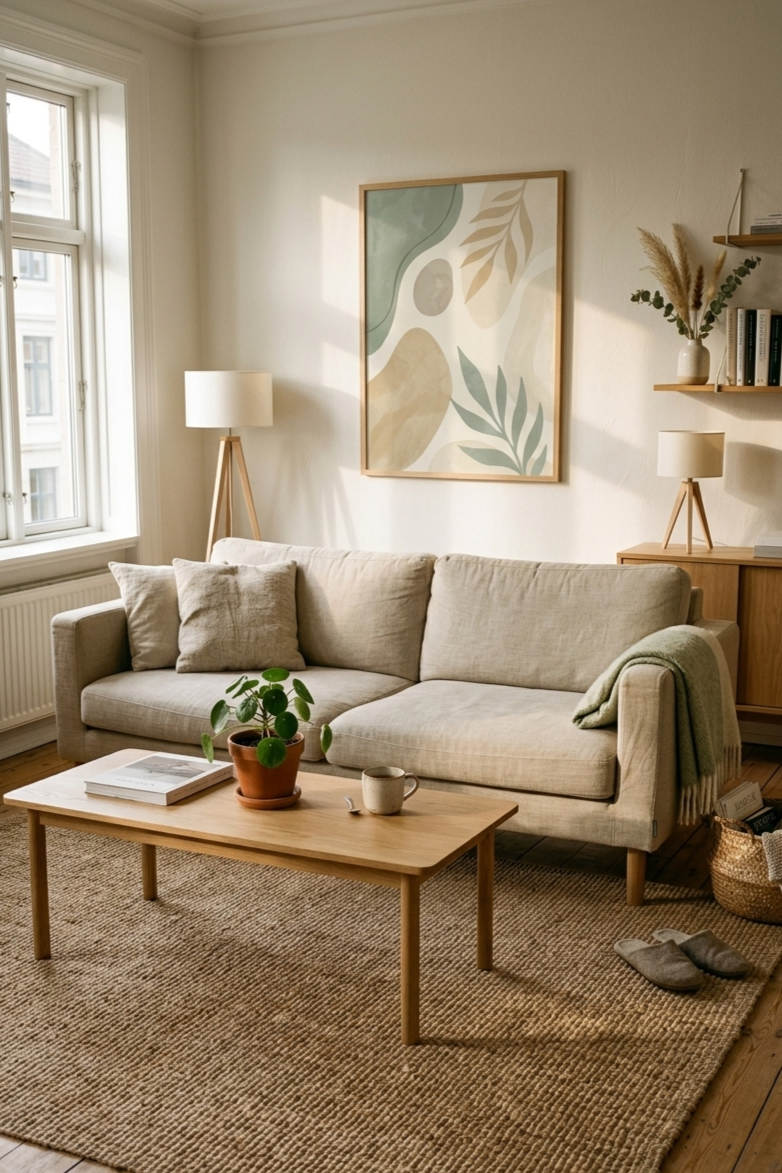
Japandi and Scandinavian interiors get this balance more right than most. They’re visually simple but not visually cold — because they build emotional calm through natural materials, warm wood tones, gentle lighting and thoughtful layers rather than through sterility. There’s a reason so many of the design principles behind these styles are actually about how a room feels rather than how it looks.
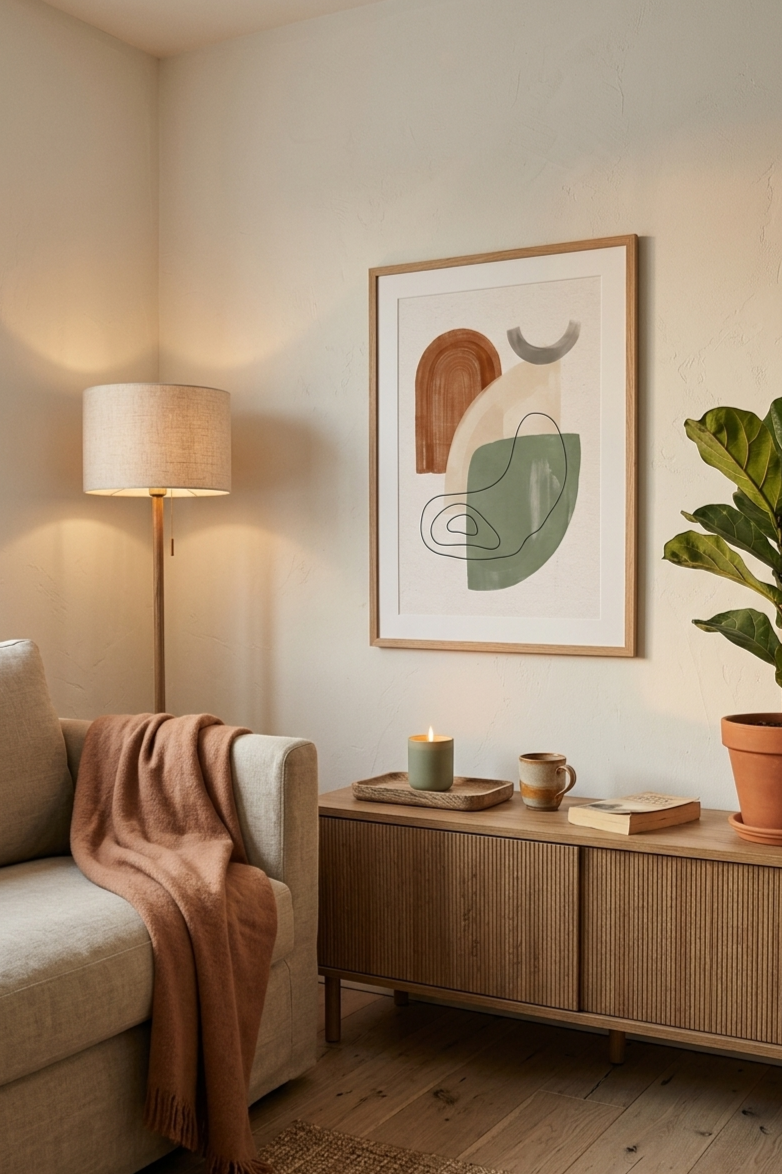
The lighting problem
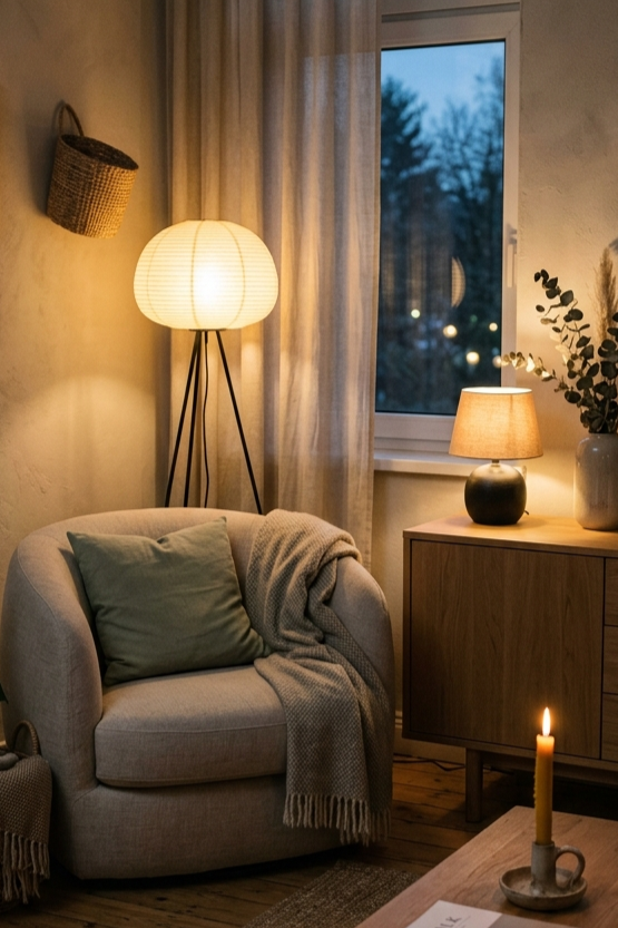
One of the most common culprits is overhead lighting.
A single ceiling light makes rooms look flat in photos and feel clinical to live in. It floods everything from one direction, kills shadows, and creates a kind of relentless evenness that your nervous system registers as institutional — like an office or a waiting room.
Calm homes layer their light. A warm floor lamp in the corner. A small table lamp on the sideboard. Candles in the evening. Light that comes from multiple low points rather than one high one creates pools of warmth, shadows in the right places, and a completely different atmosphere when you’re actually inside the room.
In a photo you barely notice the difference. In your body, you notice it immediately.
If your home feels fine in daylight and vaguely uncomfortable in the evenings, start here. It’s almost always the lighting.
The texture problem
Rooms that have been styled visually — colour-coordinated, carefully curated, well photographed — often feel cold to live in because everything has been selected for how it looks rather than how it feels.
Smooth surfaces. Hard edges. Materials chosen for their appearance. Nothing that invites you to touch it or sink into it.
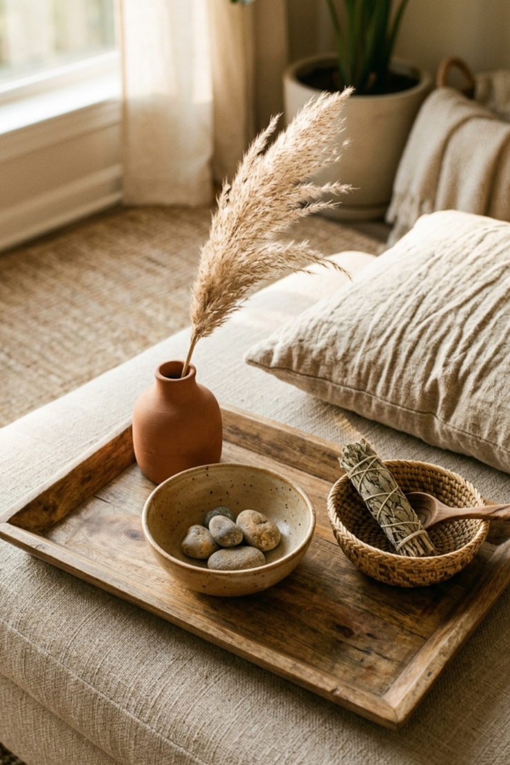
The rooms that feel best to inhabit usually have layers of natural texture. Linen cushions that are slightly rumpled. A wool or jute rug that your feet actually register when you walk across it. A woven basket that looks handmade because it is. A wooden tray with a slight grain to it.
None of these things photograph dramatically. But they’re what makes a room feel lived in rather than staged. They quietly tell your body that this is a place for humans, not a showroom.
This is also why Afrohemian interiors have been gaining so much momentum — the style is built almost entirely around texture and craft rather than visual perfection, which is why it tends to feel so warm and grounded to actually be in.
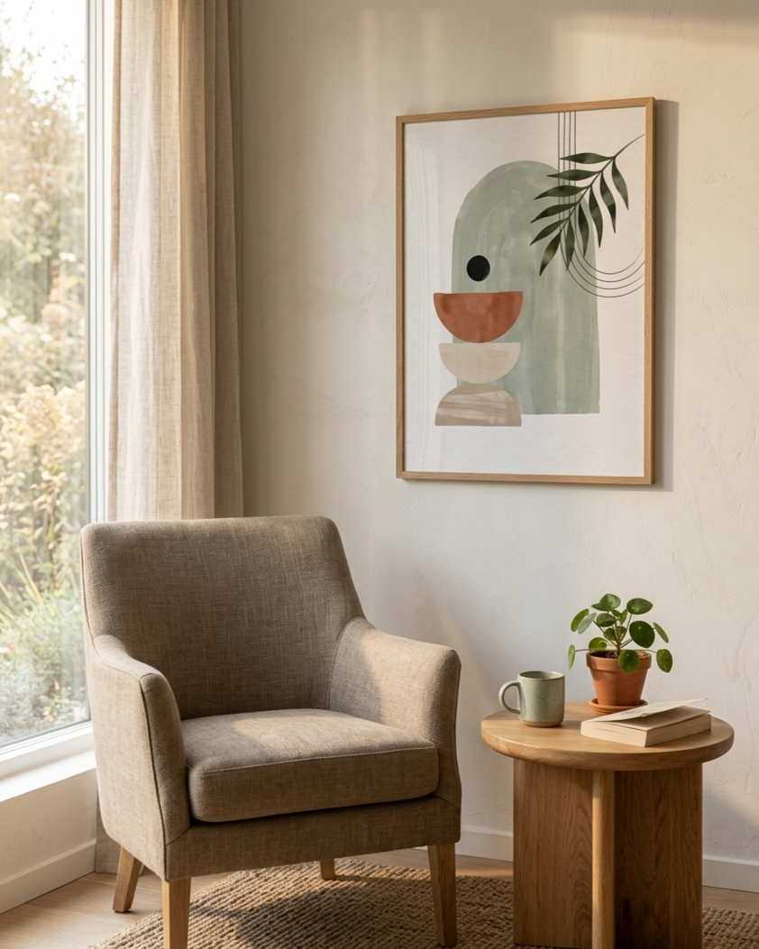
The art problem
Wall art is where this gap between visual and emotional becomes most visible.
Rooms styled for photography often have art that provides visual contrast — something that pops, that reads clearly from a distance, that fills a wall in an interesting way. And that’s fine in a photo. But in real life, art that constantly pulls your eye, that shouts for attention, that introduces a visual rhythm completely different from the rest of the room — that art quietly drains you.
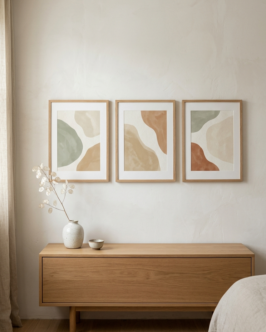
The art that’s easiest to live with tends to do the opposite. It sits with the room rather than competing with it. Soft edges, muted tones, abstract forms that give the eye somewhere gentle to rest rather than somewhere specific to land.
I’ve written more about this in why some wall art makes a room feel calmer — and some doesn’t, but the short version is: art chosen for emotional presence rather than visual impact tends to make a home feel better to inhabit, even if it’s less striking in a photograph.
The wall art I design is made with this specifically in mind — pieces in soft neutrals, sage, terracotta and warm sand tones that hold a mood rather than demanding attention.
If you want to try something before committing, the free printable set is a good place to start — the palette works in living rooms and bedrooms just as well as nurseries.
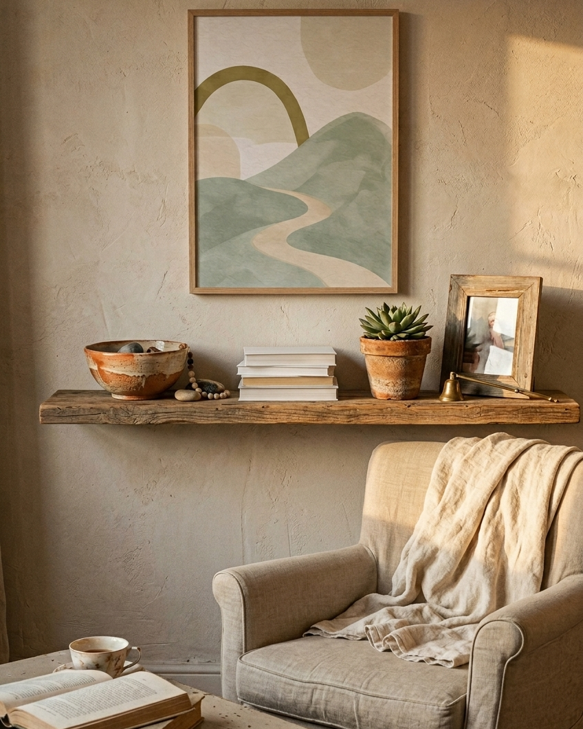
The completion problem
There’s a particular version of this feeling that comes from rooms that are almost finished but not quite.
A wall with art on it but nothing grounding it below. A shelf that’s been styled but has a slightly wrong object in it that doesn’t belong. A corner with good bones but no focal point to bring it together. These small incompletions register subconsciously even when you can’t name them, and they create a low-level visual restlessness that follows you around the room.
This is different from the minimalism problem — it’s not about having too little, it’s about having things that don’t quite resolve. And the fix is usually small. One calm corner that feels genuinely settled can change the way the entire room feels, because your eye always finds its way back there to rest.
Sometimes all it takes is getting the proportions right — art at the correct scale above furniture, objects grouped in threes, wood tones that match. The design rules behind calm interiors aren’t complicated, but they make an enormous difference to how a room feels when you’re actually sitting in it.
The belonging problem
The last one is harder to fix with a purchase, but worth naming.
A home that feels slightly wrong to live in is sometimes a home that doesn’t yet feel like yours. Not in a decorating sense — in a more personal one. Rooms that feel temporary, like you’re passing through rather than settling in, tend to photograph fine but feel unmoored. You haven’t yet put enough of yourself into them.
The fix for this isn’t spending more. It’s choosing more slowly and more personally. It’s the ceramic bowl you found somewhere specific, the print you chose because something about it felt right rather than because it matched the sofa, the plant you’ve kept alive long enough to feel attached to. Small things that mean something, even if they’re just quietly meaningful to you.
Homes that feel good to inhabit aren’t the ones where everything is perfect. They’re the ones where everything has been chosen with some level of care. That care becomes the atmosphere.
And atmosphere is the thing that photos can never quite capture — but your body registers the moment you walk through the door.
Where to start if your home feels this way
You don’t need to change everything. Usually the gap between a room that photographs well and a room that feels good to be in comes down to three things:
Warmer, layered light instead of one overhead source. More natural texture in the materials you’re surrounded by. And art or objects chosen for how they feel rather than how they look.
Start with whichever one feels most off in your home right now. Change one thing. Sit in the room and notice whether it shifts.
It usually does.
And once you start feeling the difference rather than just seeing it, you’ll find it increasingly hard to go back.
If you’d like to browse calm, minimal wall art designed for how a room feels rather than how it photographs, you can find the full collection at Peaceful Mind Living on Etsy. And the free printable wall art set is always a good place to begin.