

Most nursery decorating advice starts with furniture. The cot. The dresser. The rocker. By the time you get to the walls, the budget is gone and you are reaching for whatever is left.
But the walls are what the room feels like. They are what a baby looks at from the cot. They are what you look at during the 3am feeds. It is worth thinking about them properly — and it does not have to cost much.
This post is about building a botanical nursery aesthetic on a tight budget. Specifically, using printable wall art as the foundation and building everything else around it.
Why Botanical Works So Well in a Nursery
Botanical motifs — soft leaves, delicate insects, flowering branches — have been used in children’s spaces for a long time. There is a reason for that.
They are calm. They do not shout. They age well as the child grows. And they sit comfortably inside almost any neutral colour palette without competing with the rest of the room.
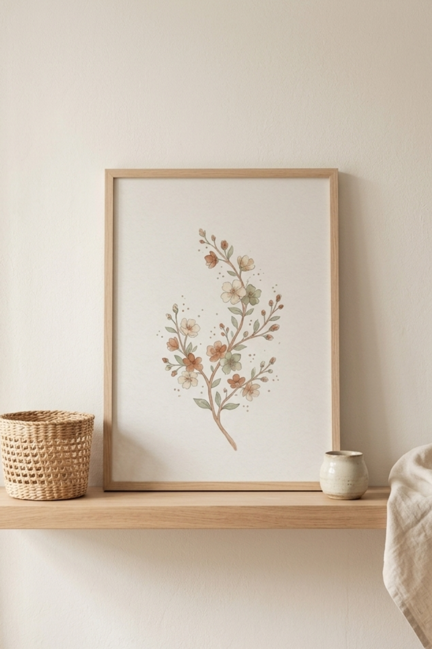
The version that works best for a calm nursery is not illustrated in primary colours with bold outlines. It is watercolour. Soft edges. Earthy, muted tones. The kind of image that looks like it was painted slowly, by hand.
The Case for Printable Art
Framed original artwork for a nursery can cost hundreds. Even mass-produced prints from homeware shops add up quickly once you factor in frames.
Printable wall art changes that completely. You buy the file once, print it at whatever size fits your wall, and frame it yourself. The total cost for a set of three prints, printed at a local print shop and put in simple oak frames, is usually under thirty euros.
The quality, if the files are high resolution, is identical to anything you would buy in a shop. Most people cannot tell the difference.
Building Around a Set of Three
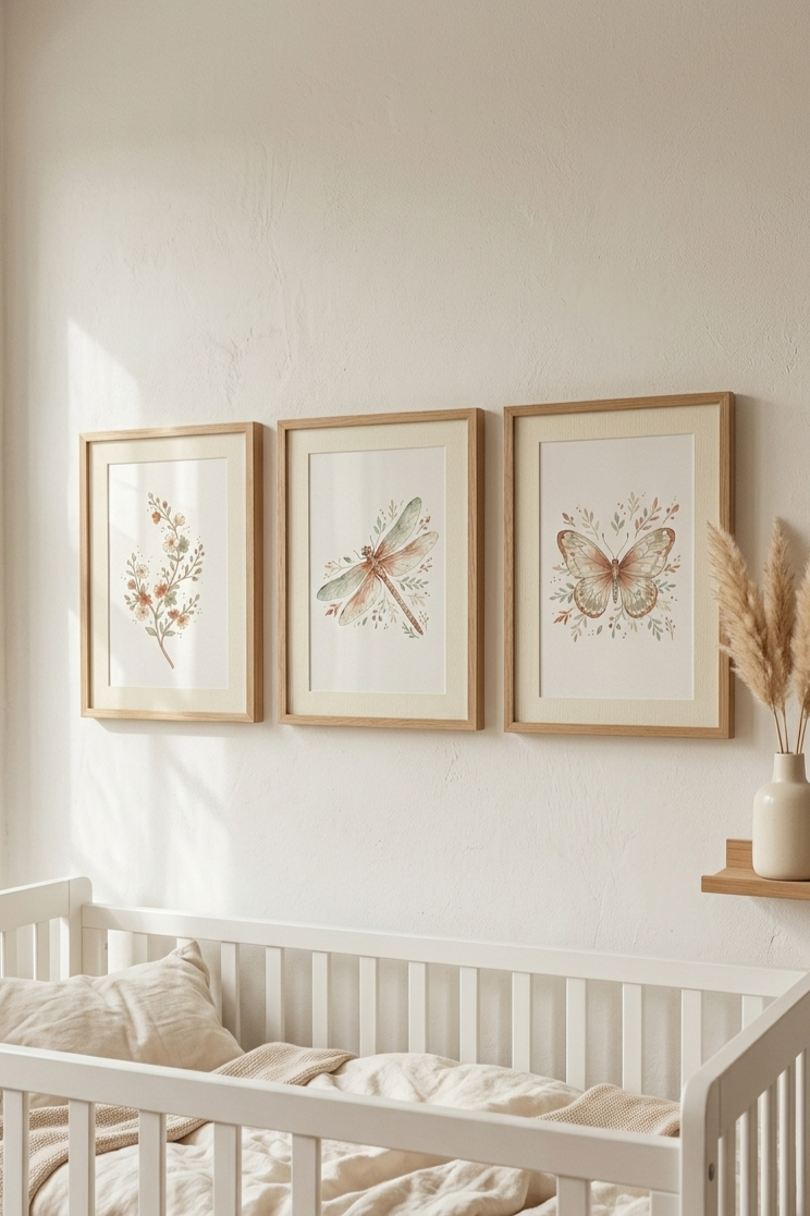
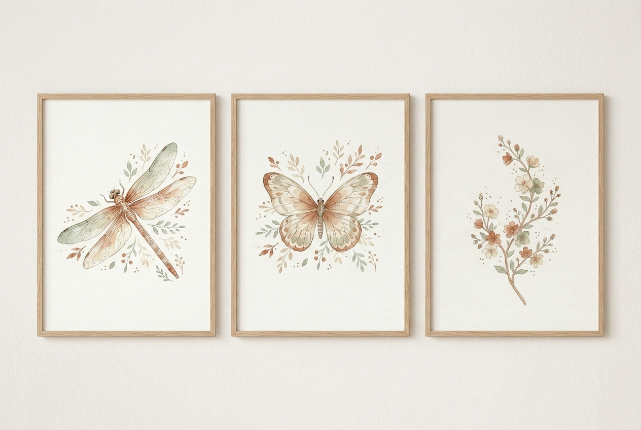
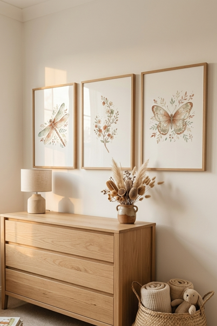
A triptych — three matching prints hung in a row — is one of the most reliable ways to fill a wall above a cot or dresser. It reads as intentional. It balances well. And because the prints share a palette and style, the room feels cohesive without effort.
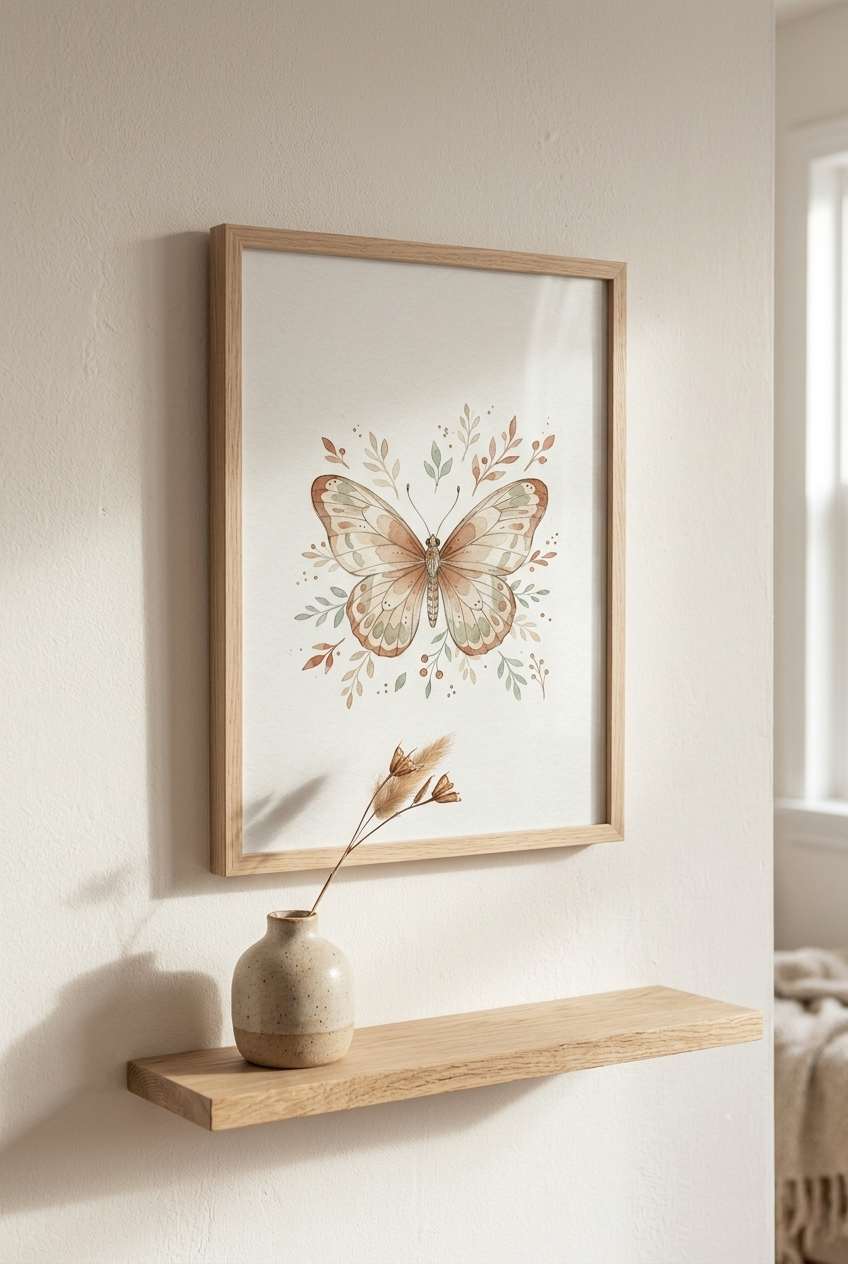
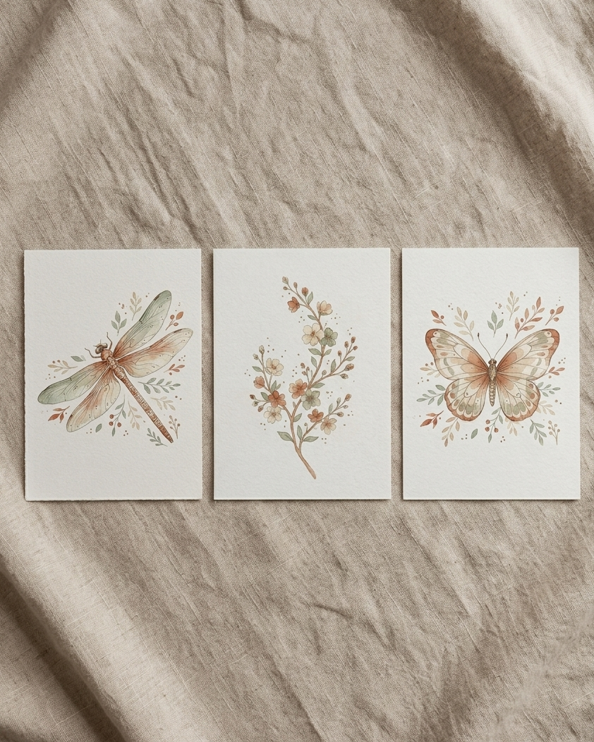
The Garden Whispers set was designed exactly for this. Three vertical botanical prints — a butterfly, a dragonfly, and a blossom branch — in warm earthy watercolour tones. Cream, terracotta, muted sage. The kind of palette that sits quietly alongside natural wood, linen, and soft white walls.
→ See the Garden Whispers set in the shop
How to Keep the Rest of the Room Simple
Once the wall art is chosen, the rest of the room can follow its lead rather than compete with it.
If your prints are earthy and soft, keep the textiles in the same register. Natural linen. Undyed cotton. A knitted blanket in cream or oat. Nothing that introduces a new colour the prints are not already using.
For shelving, raw wood or light oak reads as part of the botanical world rather than a hard contrast against it. A small ceramic vessel, a dried stem, a woven basket — these cost very little and extend the feeling of the prints into the room itself.
The goal is for the room to feel like it came from one decision, not several separate ones made at different times.
A Note on Frames
Simple light oak frames are almost always the right choice for this kind of art. They are warm enough to work with earthy tones and neutral enough not to compete.
Avoid black frames with soft watercolour prints. The contrast is too hard. White frames can work but tend to flatten the warmth of the palette.
IKEA LOMVIKEN and RIBBA frames are both reliable options that print shops cut to standard sizes. If you are using the 2:3 ratio prints, the 40×60cm size prints cleanly and fits standard frames without trimming.
Not Sure What Size to Print?
This is the question most people get stuck on. Too small and the prints feel lost above a cot. Too large and they crowd the wall.
The Nursery Wall Art Size Guide lets you enter the width of your cot or dresser and instantly see which print sizes would look balanced above it. It takes about thirty seconds and removes all the guesswork before you commit to frames.
Where to Start
If you are starting from a blank nursery wall and want a clear first step, it is this: choose the art first, then buy the frames to match, then let the textiles follow the palette.
Most people do it the other way around and end up with a room that does not quite settle. The art is the anchor. Everything else is easier once it is in place.
Not Sure Which Colours to Build Around?
The prints work best when the room palette is already settled — wall colour, textiles, wood tone. If yours is not quite there yet, the free colour palette generator lets you explore Japandi, Scandinavian, and boho palettes until something clicks. And if you want to try botanical nursery art before committing to a purchase, there is a free set of neutral nursery prints available to download — same style, no cost, useful for testing how the aesthetic sits in your space.
The Garden Whispers set — butterfly, dragonfly and blossom branch in japandi watercolour — is available as a digital download in the PeacefulMindLiving Etsy shop. Print at home or at a local print shop in any size.