
(This post contains affiliate links. As an Amazon Associate, I earn from qualifying purchases at no extra cost to you.)
Japandi has been one of the most quietly influential interior styles of recent years. It has stayed popular not because it follows trends, but because it is built around something more lasting — the idea that a home should feel calm, honest, and easy to be in.
But the style is shifting slightly. The all-neutral, light-and-airy version of Japandi that first became popular is giving way to something a little deeper. Rooms with more shadow. Richer textures. Wood tones that are darker and more grounded. And occasionally, one carefully placed note of deep blue.
It is sometimes called Dark Japandi, and it is becoming one of the most searched interior directions of 2026.
What Dark Japandi actually means
Dark Japandi does not mean dark rooms. It means rooms with more depth.
The foundations stay the same — natural materials, honest textures, negative space, and the wabi-sabi principle that beauty lives in simplicity and imperfection. What changes is the palette. Instead of pale oak and warm white, the base tones shift toward charcoal, deep clay, weathered stone, and rich timber. The room feels grounded rather than airy.
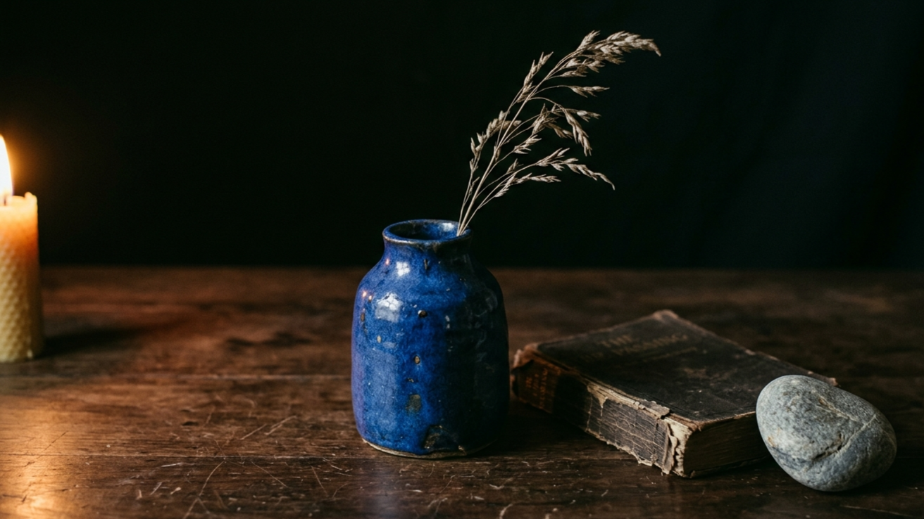
And within that grounded palette, deep blue appears as an accent. Not as a dominant colour. As a single considered note — a cobalt ceramic vase, an indigo linen cushion, one deep blue handmade bowl on a kitchen shelf. Blue that feels still rather than bright.
It works because blue, particularly in its deeper and more muted tones, behaves like a neutral. It recedes. It creates a sense of quiet depth. Paired with warm wood and natural linen, it adds just enough contrast to make a room feel alive without disrupting the calm.
Why blue and Japandi are a natural fit
There is a long tradition of deep blue in both Japanese and Scandinavian design.
In Japan, indigo dyeing — known as katazome — has been practiced for centuries. The deep, slightly uneven tones it produces are considered beautiful precisely because of their imperfection. That quality fits perfectly within wabi-sabi philosophy.
In Scandinavia, deep cobalt and navy have appeared in ceramics, textiles and folk art for generations. The same instinct that draws Scandinavian design toward honest materials also draws it toward colours that feel quiet and grounded rather than decorative.
So when blue appears in a Japandi interior, it does not feel like an intrusion. It feels like it was always going to be there.
How to bring deep blue into a Japandi home
The key is restraint. One or two pieces in the right places. Not a colour scheme.
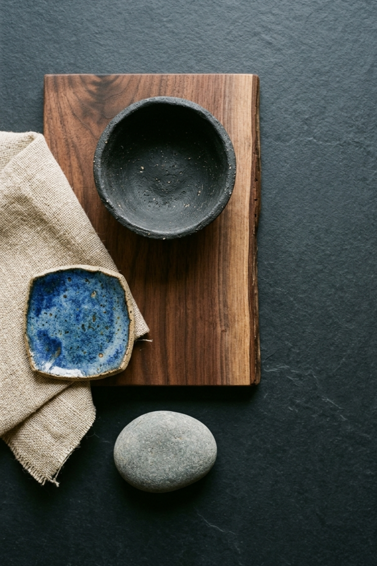
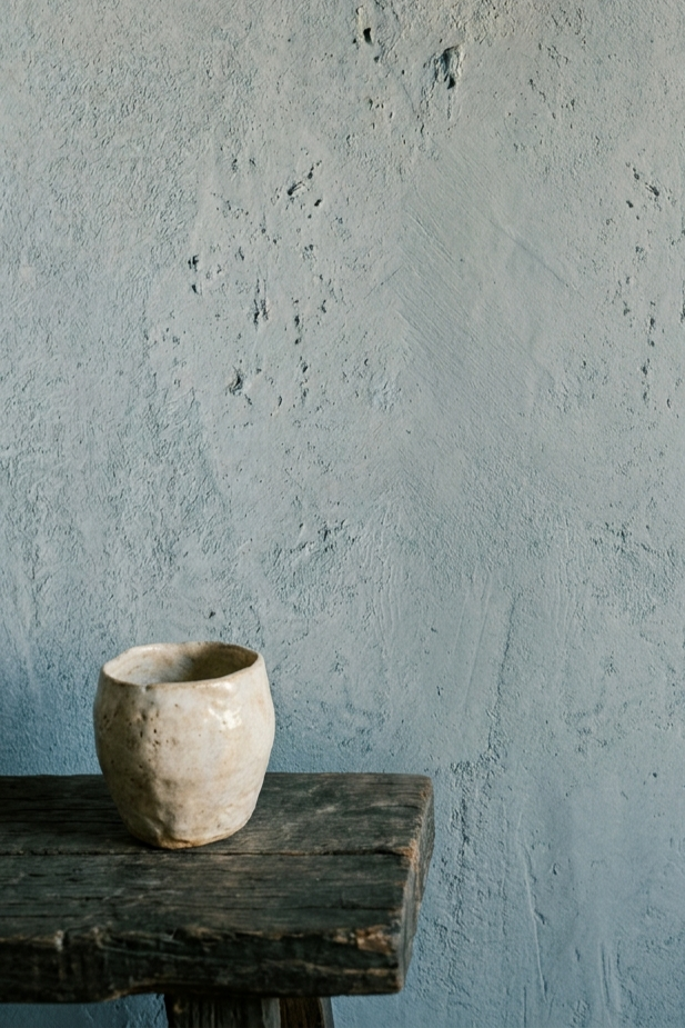
Start with ceramics
Handmade ceramics are the easiest and most natural way to introduce blue into a Japandi space. A cobalt-glazed vase, a deep blue ceramic bowl, a set of stoneware mugs with an indigo wash. The slight irregularity of handmade pieces gives them the wabi-sabi quality that makes them feel at home in this style.
Placed on a wooden shelf, a kitchen counter, or a coffee table, a single blue ceramic piece can quietly anchor the whole room.
Add one textile accent
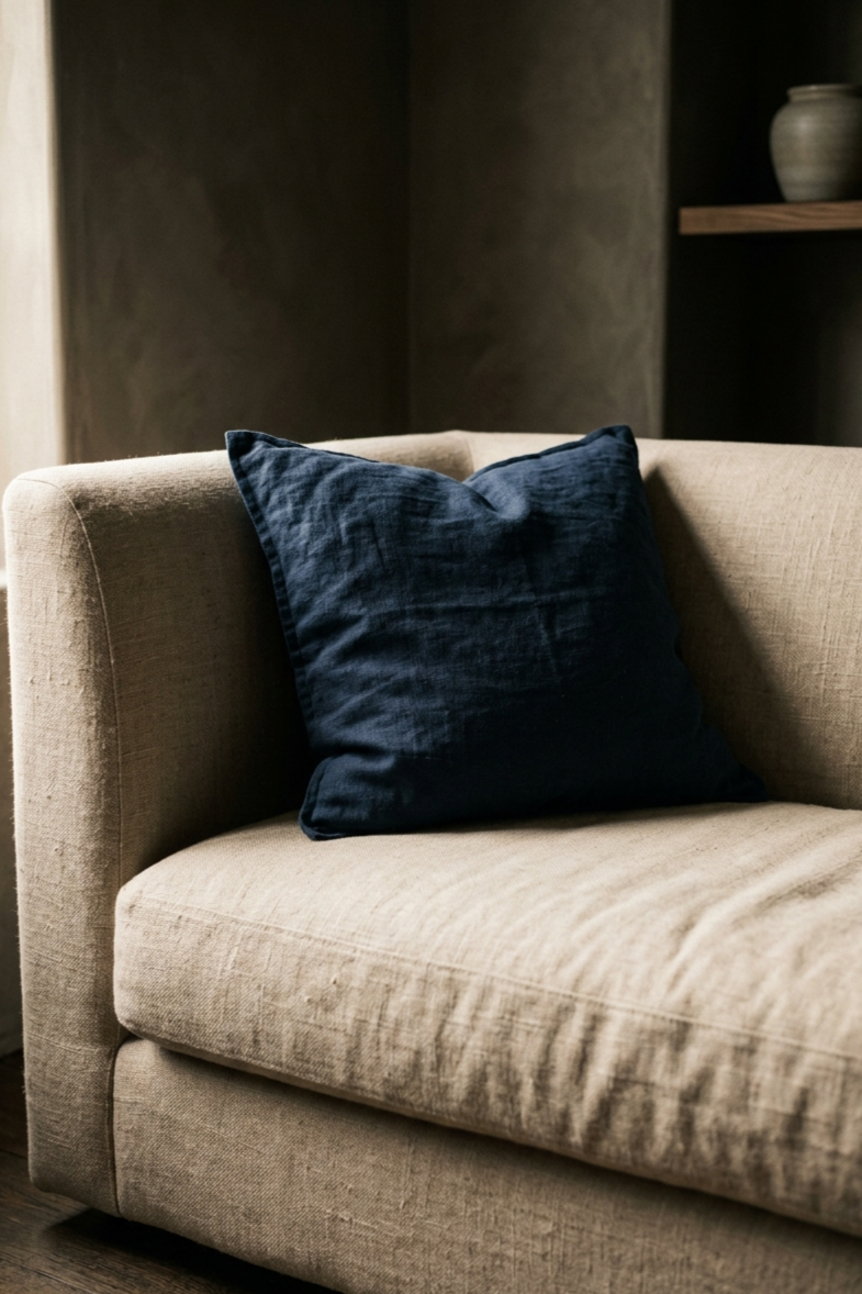
A single deep blue linen cushion cover or a navy throw can introduce colour in a completely reversible way. Linen is the right material for this — it has the natural, slightly uneven texture that Japandi responds well to, and it drapes and wrinkles in a way that feels lived-in rather than styled.
One is usually enough. The restraint is part of what makes it work.
A natural linen cushion in a deep tone placed against a warm neutral sofa creates exactly the kind of soft, low-contrast colour story that Japandi is built around.
Use blue as a wall anchor
If you want to go further, a single wall in a muted, dusty blue can transform a room without overwhelming it. The key is choosing a blue that has been taken back toward grey — a blue that whispers rather than speaks. Limewash or clay paint finishes work particularly well because their natural depth and slight texture keep the wall feeling warm and honest rather than flat.
The free colour palette generator on this site can help you find blue tones that sit well alongside the warm neutrals in your existing space.
Choose the right wall art
Wall art in a dark Japandi room should follow the same principles as the rest of the style. Soft, muted compositions. Natural forms. Nothing that competes with the quiet of the space.
This is where neutral and warm-toned Japandi prints actually work better than blue ones. When the blue is already present in the ceramics and textiles, the wall art does not need to carry it. It just needs to feel grounded and calm — which is exactly what warm neutral abstracts and organic shapes do. They anchor the room without adding more colour to manage.
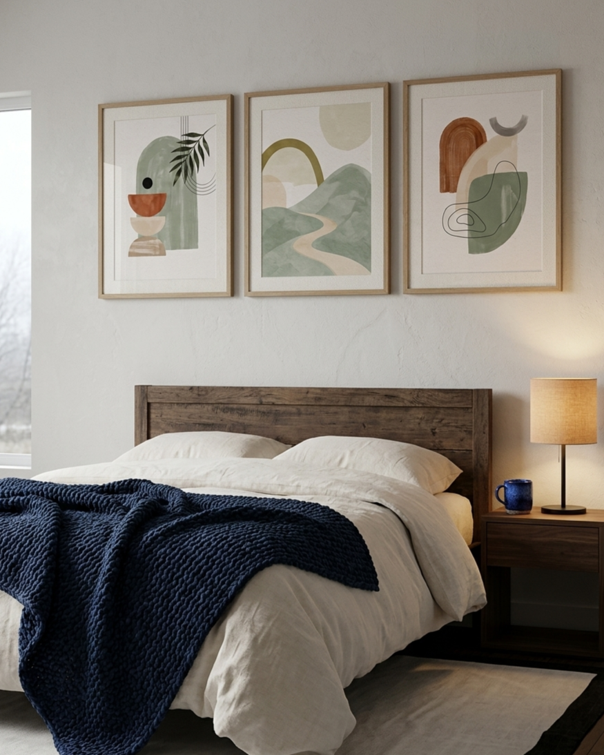
A set of three coordinated Japandi prints in soft neutral tones above a bed or reading chair gives the wall a composed, settled feeling. The blue objects in the room do the rest.
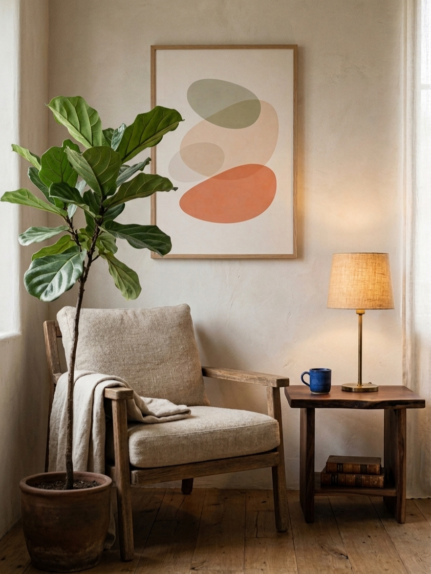
A single abstract print in warm terracotta, like this one, works well as the sole artwork in a smaller space — above a chair, a console table, or a kitchen shelf — where one quiet focal point is enough.
If you are unsure what size works in your space, the wall art size guide is a simple way to check proportions before ordering.
Room by room
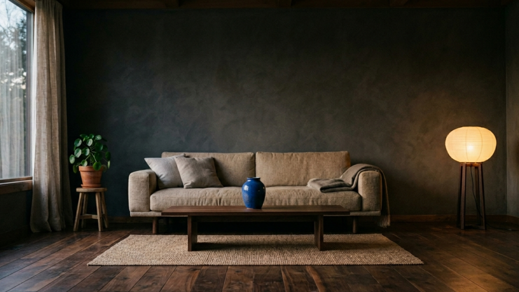
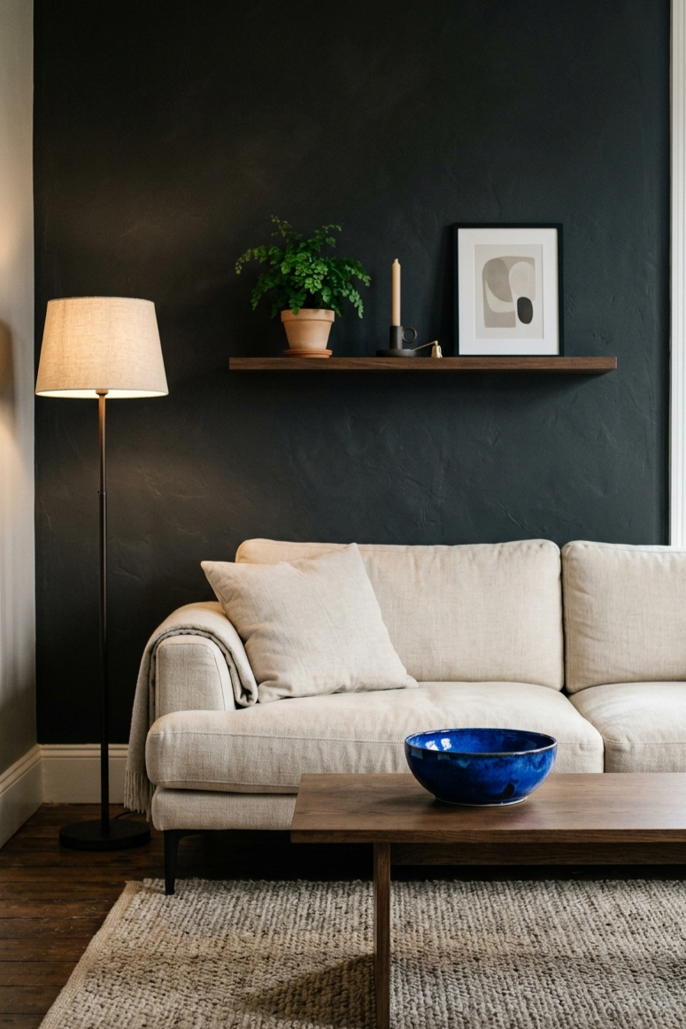
Living room
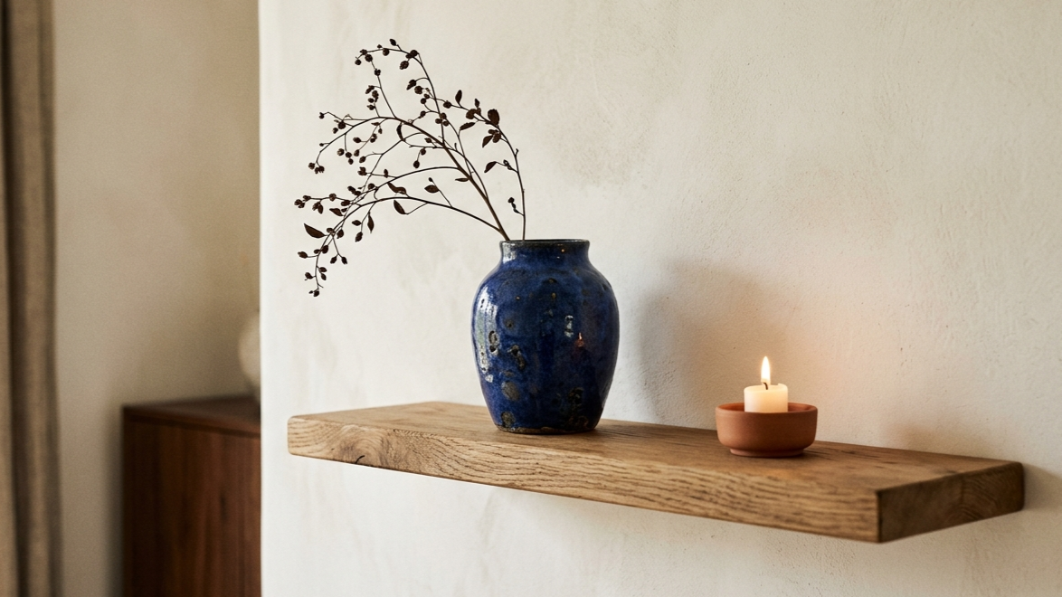
A warm linen sofa. A low wooden coffee table. One cobalt ceramic vase or bowl as the only real colour in the room. A simple floating shelf in oak on the wall behind, with a candle and a small plant alongside the art. The blue does not need to appear in more than one or two places to be felt throughout the whole room.
Bedroom
A neutral linen duvet, warm wood tones, and one deep blue accent — either a throw at the foot of the bed or a single blue ceramic piece on the bedside table. For the wall above the bed, a quiet artwork in warm neutral tones keeps the composition settled without adding more colour to balance. A soft abstract or organic Japandi print works particularly well here — calm enough to disappear into the room, present enough to make the wall feel complete.
You can read more about building a calm bedroom from scratch in this post on minimalist bedroom changes that actually make a difference.
Calm corner
A small reading corner with a warm lamp, a natural linen throw, and one piece of calm wall art above the chair is one of the simplest ways to try this look. A neutral abstract print in warm tones lets the blue ceramic or textile nearby do the colour work, while the art itself holds the composition together. It takes up very little space and requires very little investment, but the combination of warm texture and a single cool accent creates a surprising amount of atmosphere.
If you are building a calm corner from scratch, this post walks through the three elements that make the biggest difference.
Nursery
Soft blue has always worked in nursery spaces for obvious reasons — it is calm, gentle, and restful. In a dark Japandi nursery, that blue becomes slightly deeper and more considered. A dusty indigo throw in the crib, a single blue ceramic piece on the shelf, and a neutral wall art set that carries a soft blue undertone.
The free neutral nursery printable set is a good starting point if you want to experiment with the Japandi earthy tones before committing to a full dark Japandi design direction.
A few things that help
For anyone building a dark Japandi space, these are the pieces that tend to make the most difference:
- A cobalt or indigo ceramic vase — handmade where possible, for the texture
- A deep blue linen cushion cover in a natural, undyed linen weave
- A wooden floating shelf in light or mid oak for displaying ceramics and small plants
- A warm table lamp with a fabric shade — the quality of light matters as much as the colour palette
- A small ceramic tray for bedside or shelf styling — three objects on a tray always feels more intentional than three objects without one
- Calm neutral Japandi wall art from the Peaceful Mind Living Etsy shop — warm tones that ground the room while the blue objects provide the accent
The overall idea
Dark Japandi is not a dramatic reinvention. It is a quieter, more grounded version of something that was already working.
The same principles apply — natural materials, honest imperfection, space to breathe, objects that earn their place. What shifts is the mood. A little more depth. A little more shadow. And occasionally, one piece of deep, still blue that gives the room a subtle pulse without disturbing its calm.
It is a small change that tends to make a room feel significantly more considered.
For calm, minimal wall art designed for Japandi and neutral interiors, you can browse the full collection at Peaceful Mind Living on Etsy. And if you would like to try something before committing to a purchase, the free nursery printable set is a good place to start.