
Most people pick a paint color, bring home the sample, hold it up to the wall and then feel completely stuck about what to put with it. Color matching is genuinely hard when you are staring at four walls and furniture you already own.
This is the problem I wanted to solve.
The way most people approach color is backwards
You fall in love with a color — a warm sage, a soft terracotta, a dusty blush — and spend the next three weeks on Pinterest trying to figure out what goes with it. You save thirty photos. Half of them contradict each other. You are still not sure.
The issue is that color does not exist in isolation. A sage green that looks beautiful in a Japandi living room with raw linen and light wood can look completely wrong in the same room with cool grey furniture and white walls. Context changes everything.
A generic color wheel is not enough. Interior color is about saturation, warmth and how colors feel together in a specific style.
What the tool actually does
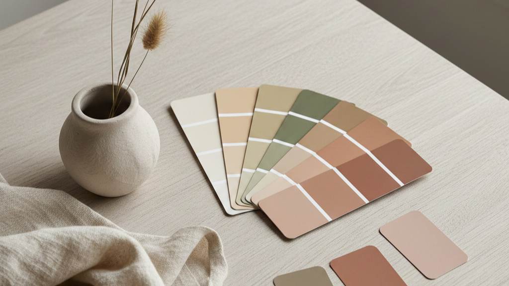
I built a free color palette finder that starts from the color you already have and builds a small, usable palette around it based on the interior style you are going for. You pick your color, choose your style, and get three companion colors with hex codes, suggested uses and real paint name references.
Here is what it looks like in practice.
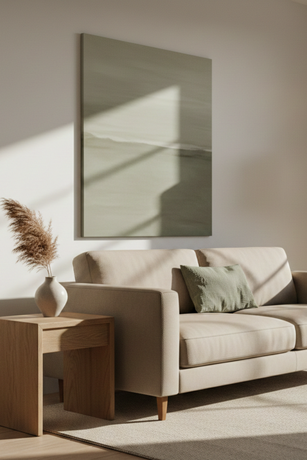
Say you have a warm beige sofa. Pick that color, choose Japandi, and the tool gives you a light version for your walls, a muted sage green for an accent cushion or plant pot, and a deeper warm brown for grounding elements like a wooden side table or dark frame. Suddenly you have a palette that feels considered.
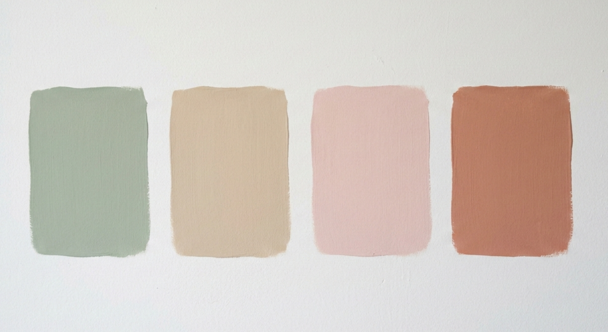
Or say you are painting a bedroom and you are drawn to a dusty blush. Select Scandinavian and you get a pale almost-white for the walls, a soft warm grey for bedding, and a slightly deeper rose for a small accent. Clean, calm, cohesive.
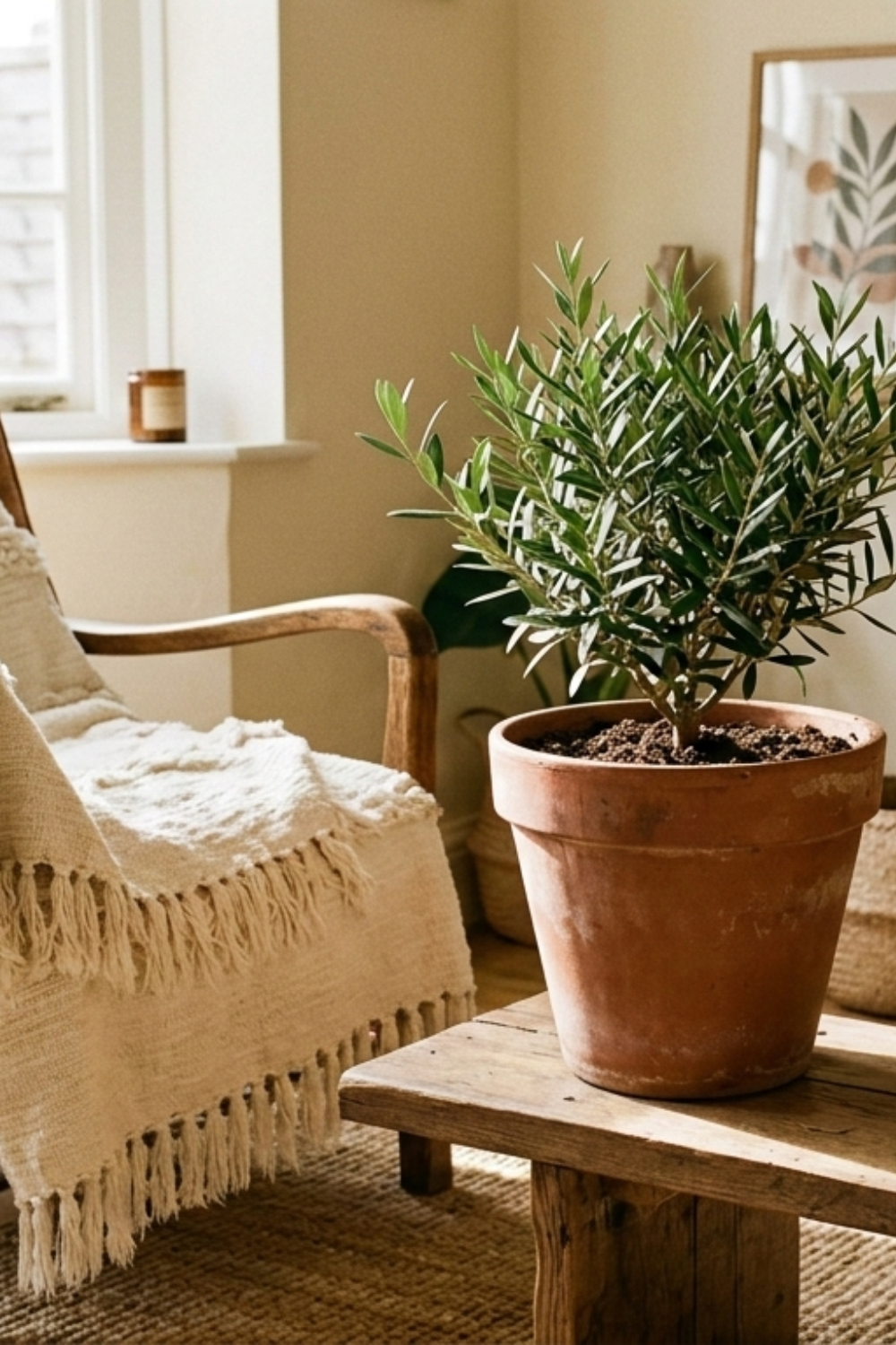
Boho is where it gets more interesting. Start with a clay terracotta and the tool gives you a warm cream for textiles, a burnt rust for a statement wall or ceramic pot, and a dusty olive as the grounding color. The combination that makes a boho room feel warm and intentional rather than chaotic.
Why the style filter matters
The same color produces completely different results depending on which style you pick, and that is intentional.
Japandi tends toward quieter companions. Lower saturation, more restraint, one soft accent rather than two competing ones. Scandinavian keeps everything light and airy with just enough variation to create depth. Warm Boho pushes the hue shifts further for more personality. Coastal Calm leans into soft blue-greens and sandy neutrals, muted enough to feel like being near water.
None of them are wrong. They are just different answers to the same starting color.
A few ways to use it
The obvious use is picking wall paint. But it works just as well for smaller decisions: what color throw to add to a sofa you already have, whether a terracotta pot will work in a mostly white corner, what shade of linen curtain feels right in a warm room.
It is also useful when shopping online. Drop in the closest color to what you already have at home and see what the tool suggests. If the item you are considering sits somewhere in that range, it will probably work.
Try it here
Pick a color, choose a style, see what comes back. Sometimes the result confirms what you were already thinking. Sometimes it shows you a combination you would never have tried yourself, and that is usually the more interesting outcome.