
There’s a reason some homes make you exhale the moment you walk in, while others — even beautiful ones — feel strangely restless.
It’s usually not about how much decor there is, or how expensive anything looks. It’s about proportions, spacing, and quiet visual rules that designers follow almost without thinking. Once you start noticing them, you see them everywhere in calm Scandinavian homes, Japandi interiors, and minimalist spaces that feel grounded instead of busy.
These are the small rules that change how a room feels without you buying more things. In fact, most of them are about adding less, spacing things better, and letting the room breathe.
(This post contains affiliate links. As an Amazon Associate, I earn from qualifying purchases at no extra cost to you.)
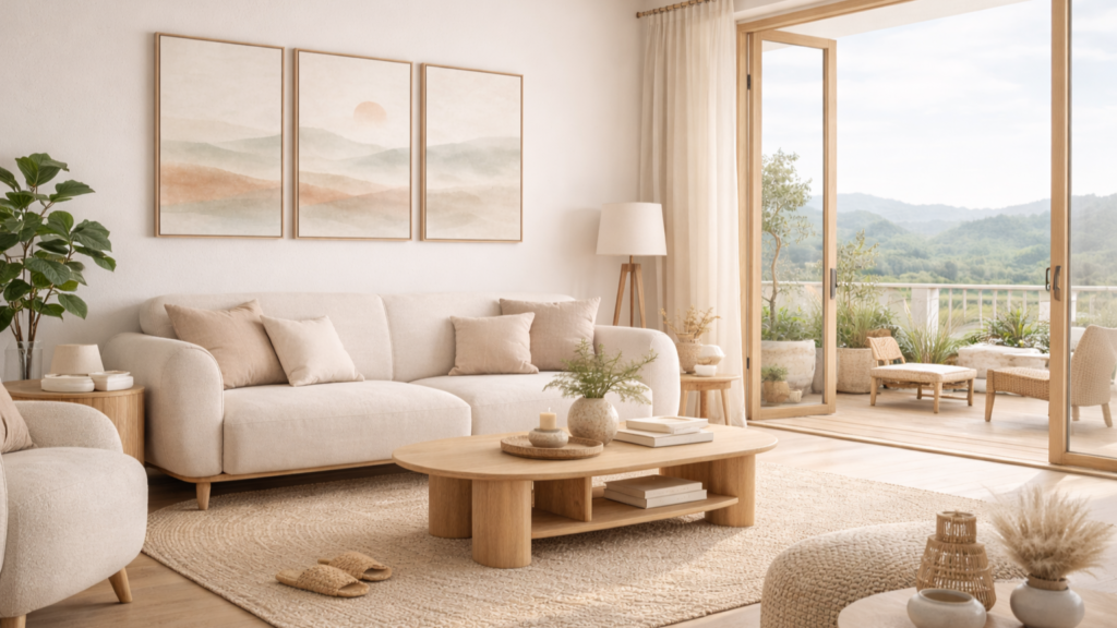
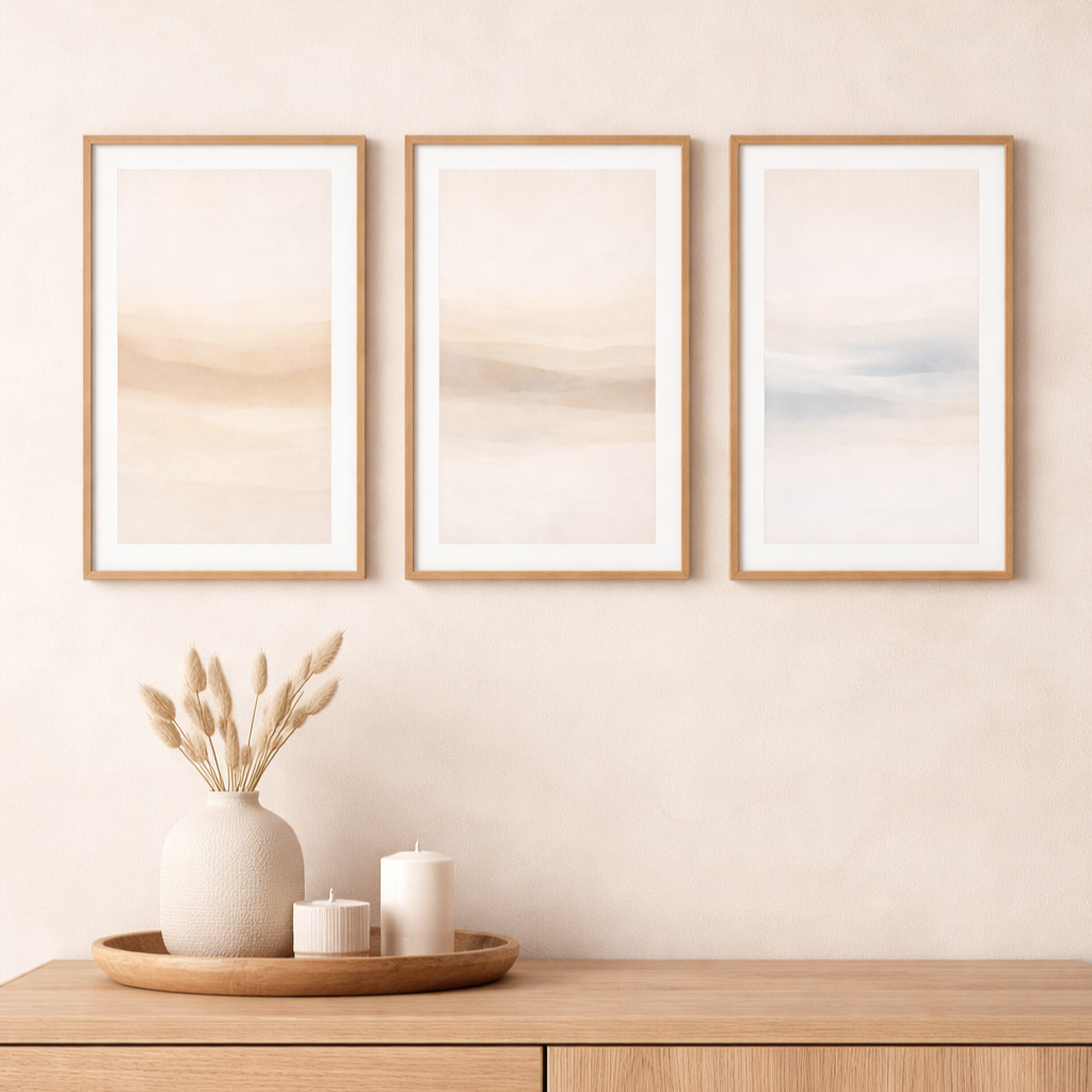
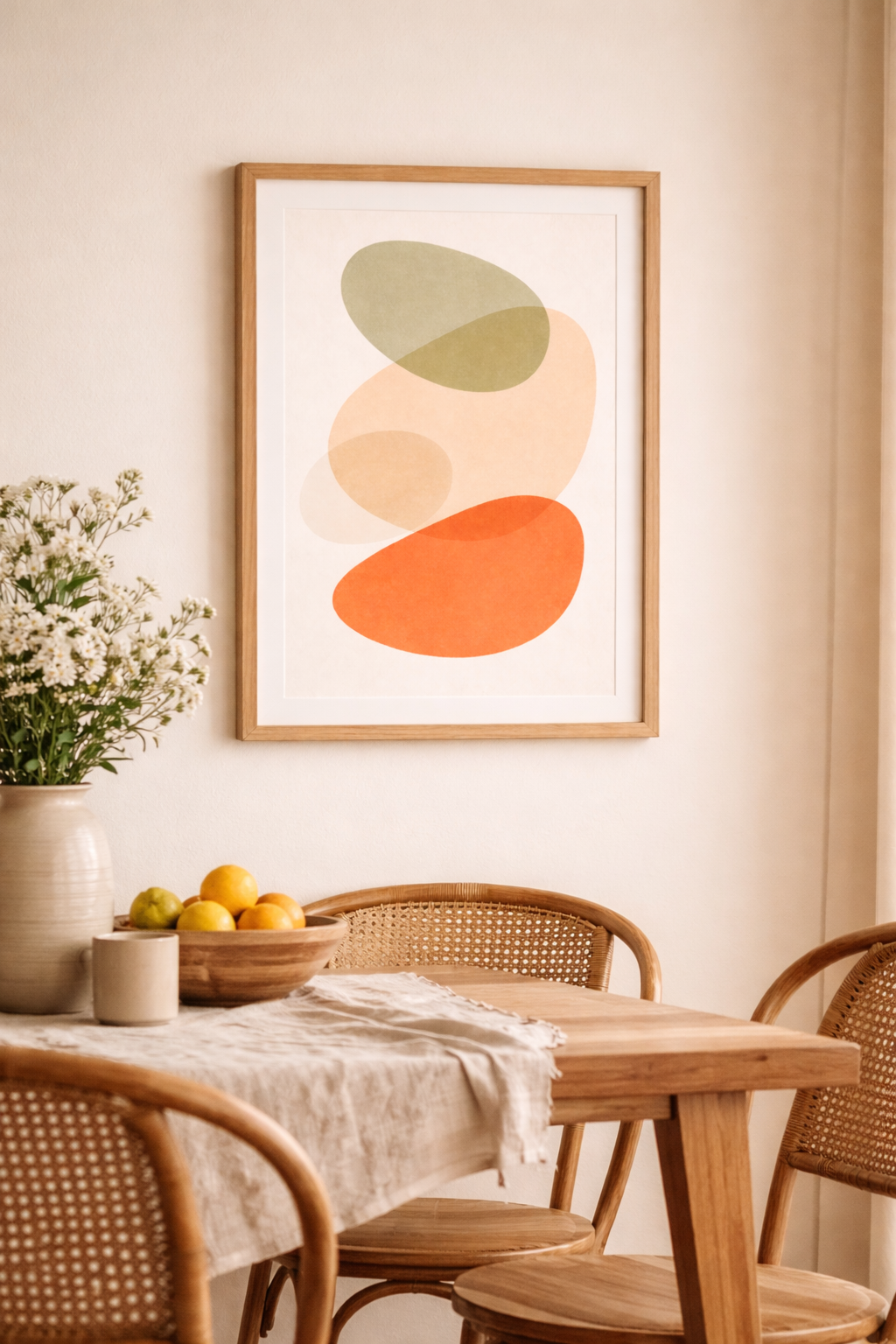
The 2/3 Rule: why art often looks “off” above furniture
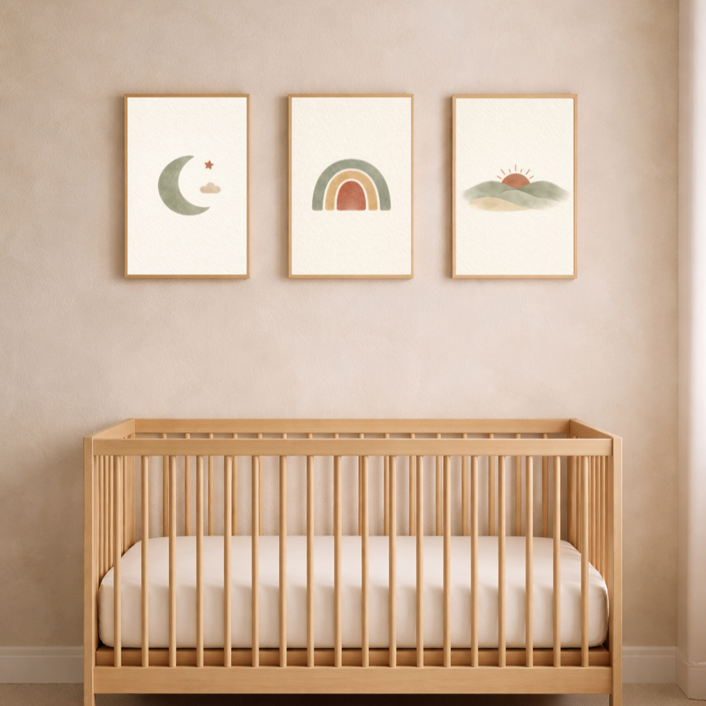
One of the most common reasons a wall feels awkward is that the artwork above furniture is either too small or too wide. Designers often follow a simple proportion: the art should take up about two thirds of the width of the furniture below it.
If a crib is about 120 cm wide, the art above it should visually span around 80 cm. If a dresser is the same width, the same rule applies. This is why a set of three prints in thin oak frames so often looks balanced above a crib or dresser, while a single small frame can feel lost on the wall. If you’re unsure about sizing, this wall art size guide makes it very easy to get the proportions right.
This proportion is subtle, but once you see it, you can’t unsee it. It’s one of the main reasons calm nurseries and bedrooms feel harmonious instead of cluttered.
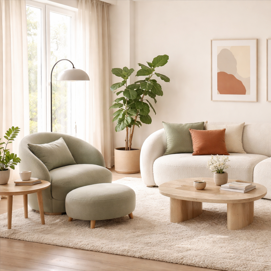
The 60–30–10 color rule, but in Japandi tones
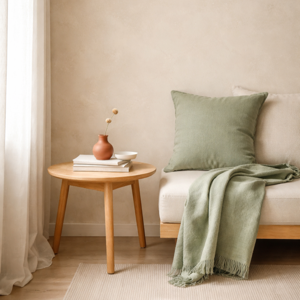
Calm homes rarely use many colors, but they do use contrast very gently. A common interior guideline is the 60–30–10 rule. About sixty percent of the room is one main base tone, thirty percent is a secondary tone, and ten percent is a quiet accent.
In Japandi and Scandinavian interiors, that often looks like warm beige or sand tones covering most of the room through walls and textiles. Sage green appears in smaller amounts through art, cushions, or ceramics. A tiny touch of terracotta shows up in a print, a vase, or a throw pillow.
You don’t notice the math when you’re in the room. You just feel that everything belongs together.
The rule of three: why groups of three feel calmer than pairs
When styling a surface like a dresser, shelf, or tray, three objects almost always look more natural than two or four. A small ceramic vase, a candle, and a wooden tray instantly feel intentional, while two objects can feel accidental and four can start to look crowded.
The same principle is why sets of three frames work so well on a wall. Your eye moves gently from one to the next without getting stuck.
This rule shows up everywhere in calm homes. On coffee tables, on shelves, and especially on walls.
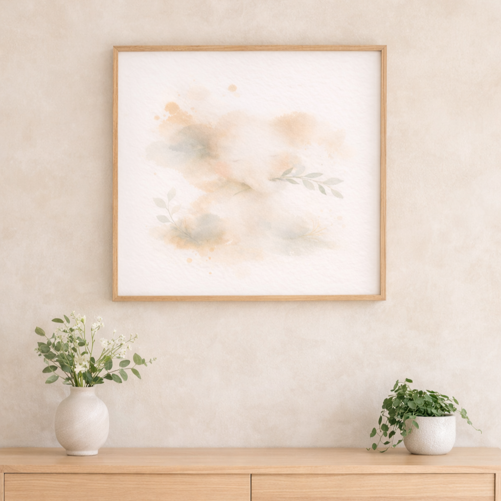
The empty wall rule: negative space is part of the design
A calm home is not a filled home. Designers deliberately leave parts of the wall completely empty so that the eye can rest.
Instead of creating a gallery wall with many small frames, one properly sized artwork with generous space around it often feels far more peaceful. The emptiness is not a missed opportunity. It’s what makes the room breathe.
This is especially noticeable in nurseries and bedrooms where too many small decorations can create subtle visual noise without you realizing it.
The one-material rule: repeating the same wood tone
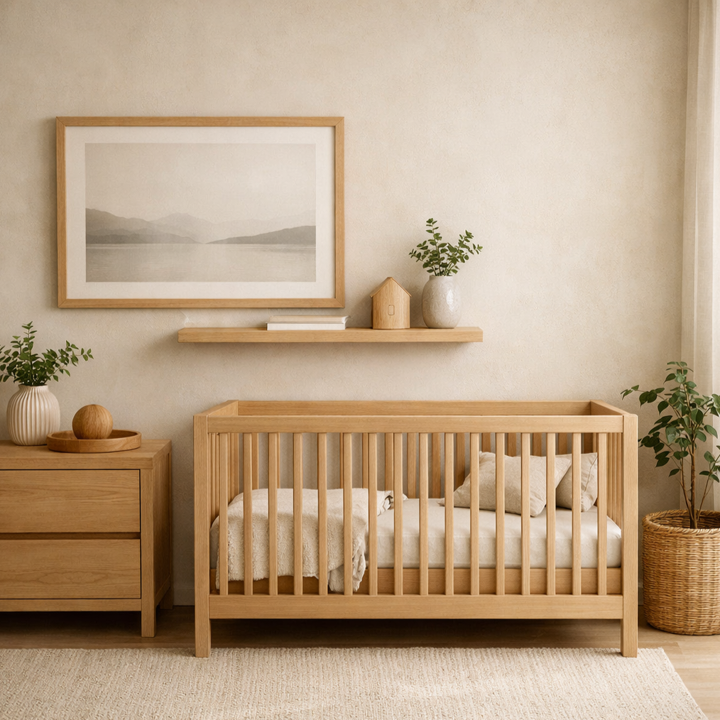
Look closely at calm Scandinavian interiors and you’ll notice something interesting. The wood tones usually match. Light oak appears in the crib, in the picture frames, in the shelf, sometimes even in small decor items.
When different wood tones compete, the room can start to feel busy without you knowing why. Repeating the same material quietly ties everything together.
A simple oak frame above an oak dresser looks natural because the material speaks the same language.
The eye-level rule: where art should actually hang
Most people hang art too high. Designers often center artwork around 145–150 cm from the floor to the middle of the frame. This keeps the art in your natural line of sight and makes the room feel grounded.
When art is too high, the wall feels disconnected from the furniture. When it’s at eye level, everything starts to feel anchored and calm.
The soft contrast rule: calm homes avoid harsh black and white
High contrast combinations like bright white against deep black can feel sharp and energetic. Calm homes usually work with softer contrast instead. Sage against beige. Terracotta against sand. Warm neutrals layered gently on top of each other.
This is why watercolor textures, soft edges, and muted palettes feel so natural in these spaces. Nothing shouts for attention, but everything still has depth.
Why these small rules change how a room feels
None of these rules require more decor. Most of them actually ask you to use less, space things better, and choose items that quietly belong together.
That’s why Scandinavian and Japandi interiors feel so peaceful. They aren’t empty by accident. They follow simple visual principles that allow the room to feel balanced, breathable, and calm.
Once you start applying these rules, you’ll notice that your home doesn’t just look better. It feels lighter to be in.